
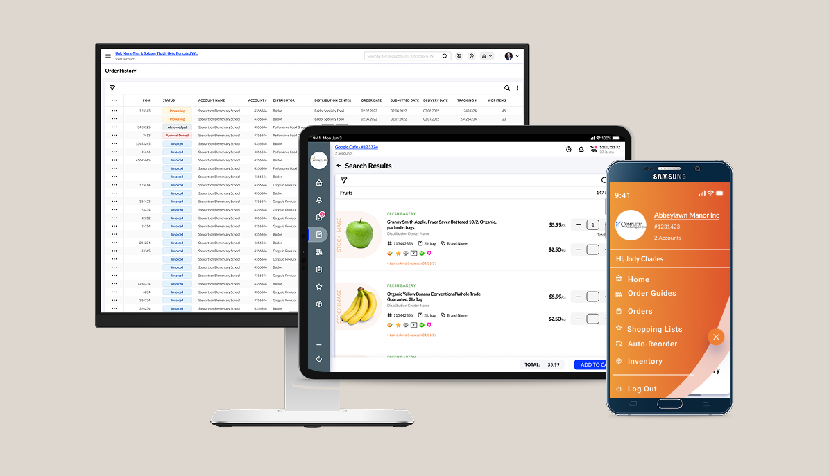
Outdated Order Management Tool Blocks Efficiency, Prompting Full Redesign for Foodservice SaaS Platforms. Web, Tablet, and Mobile.
Tools & Responsibilities
Design: Figma (lo-fi FigJam sketches, high-fidelity designs)
Handoff & Documentation: Figma Dev Mode, design system updates, component documentation
Research: UserTesting (moderated + unmoderated), UserZoom, synthesis of quant + qual data, user personas, journey maps
Communication & Org: Slack, Zoom, Google Suite
Tasks:
UX Researcher
Design System Contributor
Designing for web, tablet, and mobile
Developer handoffs
Stakeholder presentations
Cross-functional team feedback loop
Timeline:
Two-week Sprints
Longitudanul studies
My Time With iTrade
At iTradeNetwork, I joined the UX team during a period of rapid growth and evolving priorities across four core products—Order Management Service (OMS), Freight, Fresh, and Order Maestro (OM)—each serving a distinct but interconnected role in the food logistics ecosystem. I had to hit the ground running, quickly building platform knowledge and integrating seamlessly into a high-performing team that was already in motion. This required adaptability, fast learning, and strong collaboration skills to contribute effectively from day one.
The overarching project goal was to improve usability, streamline workflows, and unify the design language across platforms while preparing for mobile and tablet launch.
One of my proudest contributions was establishing the company’s first usability testing process. Prior to my arrival, usability insights weren’t part of the design cycle. I researched testing platforms, advocated for their adoption to the VP of Design, and built a process from scratch, making research a consistent, actionable part of the team’s decision-making.
Quick Links
Streamlining a complex Supply Chain platform to better support diverse user needs and evolving business goals.
This section includes:
Business Needs
Problem Statement
How Might We
Business Issues:
How might we modernize and unify iTradeNetwork’s product suite to improve usability, increase adoption, and better support the day-to-day workflows of users across procurement, compliance, and logistics?
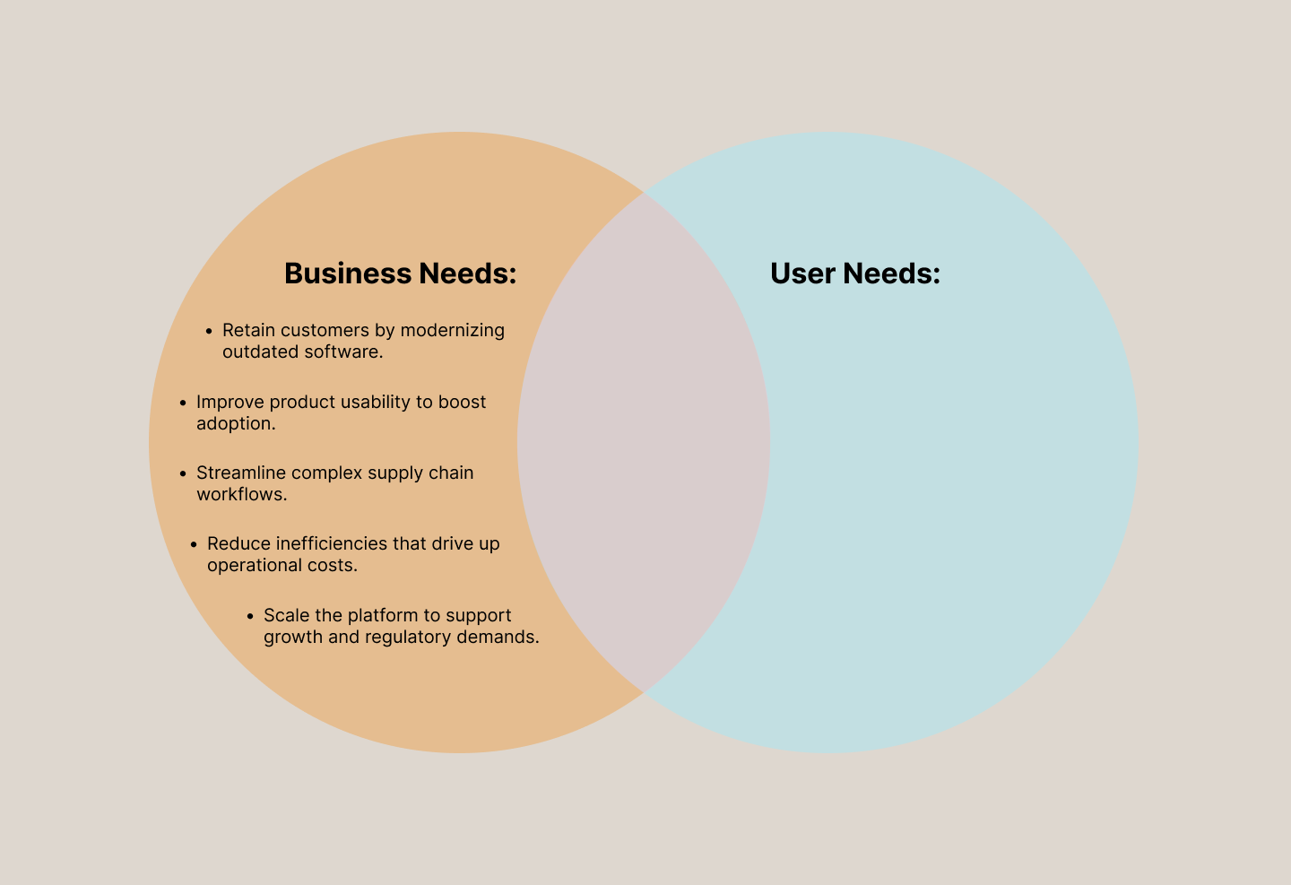
Founded in 1999, iTradeNetwork led digital procurement for perishables. But by the early 2020s, it began losing major clients due to outdated software and increased competition.
As the flagship product, OMS had low adoption of its new design, under 40% initially. I led user research to uncover pain points, resulting in a 15% adoption increase within one quarter.
Company Problem Statement
While iTradeNetwork had long been a leader in perishables supply chain technology, many of its core systems had gone years without meaningful updates. Legacy workflows, outdated interfaces, and disconnected tools caused user frustration, reduced efficiency, and lost business. Across product lines, internal teams lacked direct feedback from end users, and design decisions were often made without real usability data. To stay competitive and meet modern user needs, iTrade needed a unified, user-centered approach to product improvement across all workstreams.
Quick Links
Now that we’ve clarified the business needs, it’s time to uncover what users need.
We had our assumptions, especially around why users weren’t adopting the new site, but were they accurate? This discovery phase aimed to validate those beliefs, identify genuine pain points, and ensure that the solutions we build are grounded in the way people actually work, not just how we think they do.
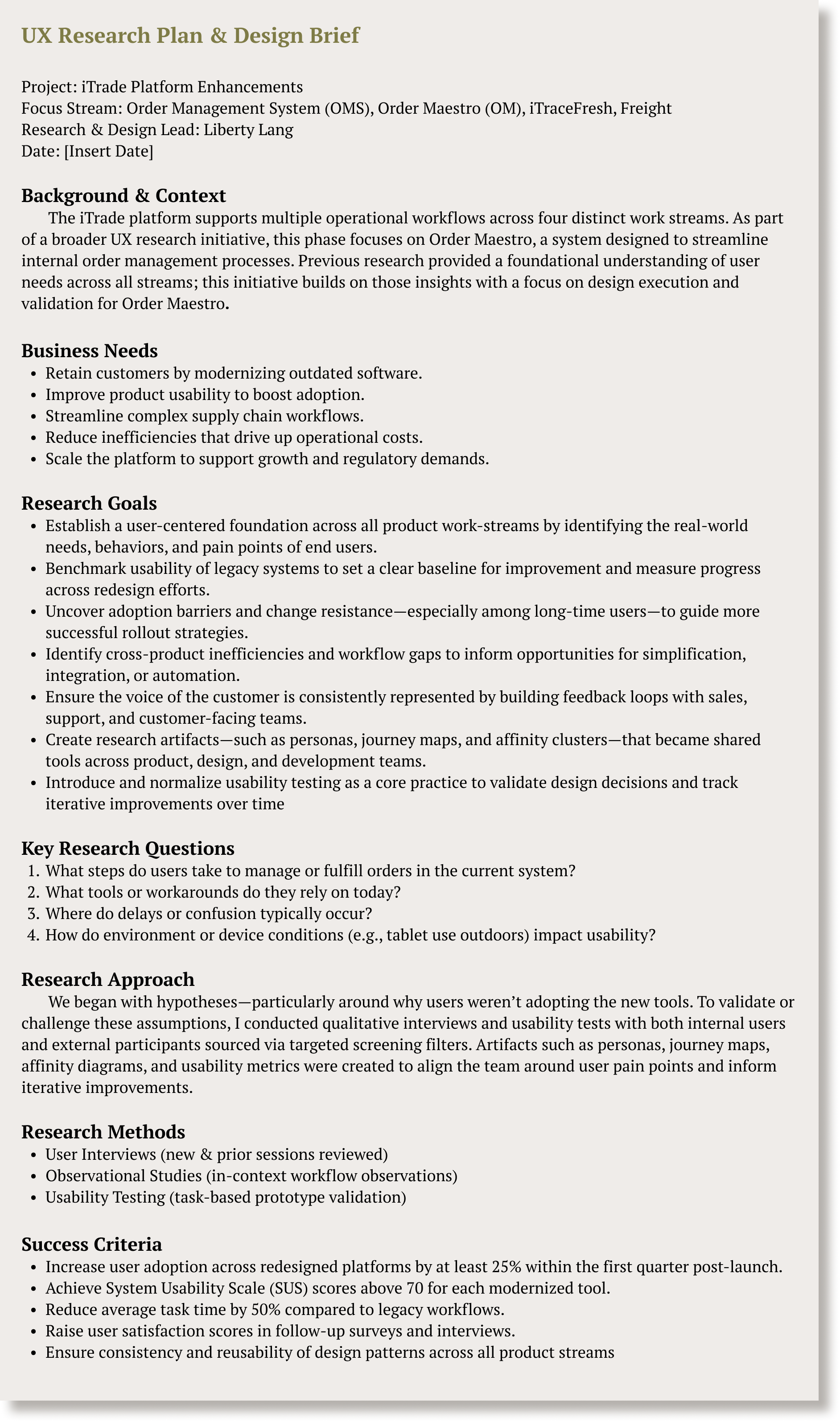
I began by creating a Research brief to clarify the specifics.
Goals Of The Research:
Establish a user-centred foundation across all product workstreams by identifying end users' real-world needs, behaviours, and pain points.
Benchmark usability of legacy systems to set a clear baseline for improvement and measure progress across redesign efforts.
Uncover adoption barriers and change resistance—especially among long-time users—to guide more successful rollout strategies.
Identify cross-product inefficiencies and workflow gaps to inform opportunities for simplification, integration, or automation.
Ensure the voice of the customer is consistently represented by building feedback loops with sales, support, and customer-facing teams.
Introduce and normalise usability testing as a core practice to validate design decisions and track iterative improvements over time.
Method:
Usability Benchmarking
Usability Testing
Journey Mapping
Persona Refinement
Observational Studies
This section includes:
Research Brief & Goals
Methods, why & outcomes
Design Strategy

Why We Used It:
To quantify baseline performance between legacy vs new versions of OMS
To capture sentiment, resistance points, and feature gaps directly from users
To understand product pain points, like creating lists with pen and paper, and then transferring that information digitally
Match product choices to real user needs and habits by personalizing their experience.
To uncover unspoken needs in real-world contexts
Design Strategy: Modernizing and Unifying a Complex Platform
Outcomes:
Revealed 57% faster task time in new version, but 1 in 3 users still failed key flows
Helped uncover issues with system feedback and confusing navigation
Informed roadmap direction & prioritization
Allowed the Design team to reflect on validated assumptions vs invalidated.
Found tablet use in bright environments → led to prioritizing dark mode for better visibility
After synthesising the research, I partnered with product managers, engineering leads, and the VP of Design to establish a design strategy that aligned business goals with user expectations.
Our design strategy centred on six principles:
Prioritise speed on high-frequency tasks
Reduce time on task by improving search flows, streamlining ordering, and simplifying navigation.Create a unified experience across devices
Ensure consistency across web, tablet, and mobile for users who alternate environments throughout the day.Increase system visibility and trust
Improve feedback loops with clear confirmations, error messages, and status indicators.Support real-world use cases
Design for outdoor use, warehouse environments, and low-connectivity situations whenever possible.Reduce cognitive load
Simplify interactions by grouping related actions, reducing unnecessary fields, and optimising the information hierarchy.Build scalable patterns
Develop reusable components and design patterns that reduce future development effort and maintain visual consistency.
These principles guided the redesign across all platforms and ensured our solutions remained future-proof as products evolved.
Quick Links
Synthesis of user feedback revealed core pain points, unmet needs, and opportunities that shaped next steps.
This section includes:
Clear Patterns
Persona
Journey Map
Outcomes from Usability Testing Benchmarking
Participants
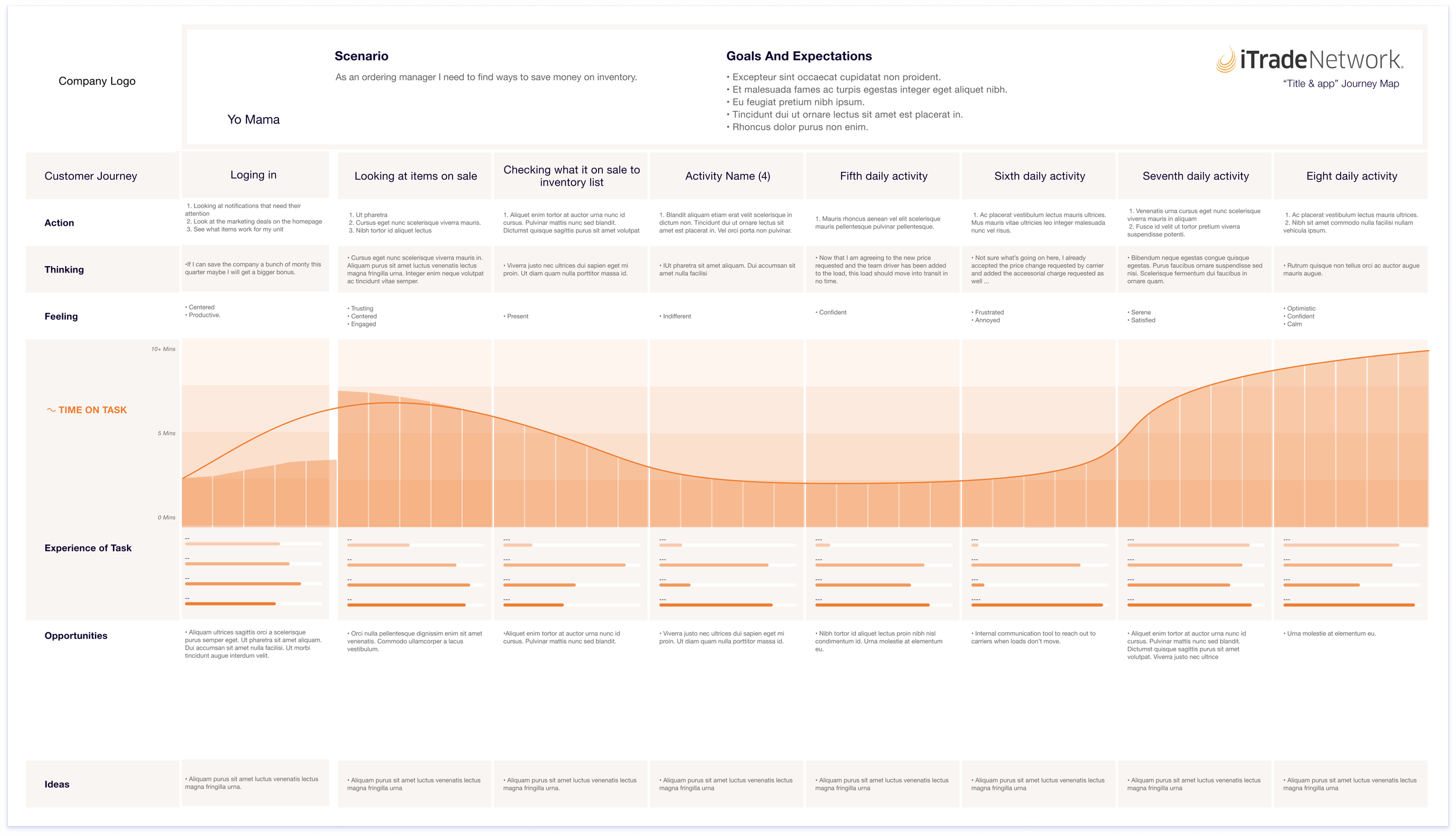
After conducting usability testing, benchmarking legacy vs. modern systems, running observational studies, and mapping user workflows across OMS, Freight, Trace, and Maestro, I synthesized findings into clear patterns. These insights surfaced the major friction points preventing adoption, revealed unmet needs, and highlighted the highest-impact opportunities for improvement. This synthesis became the foundation for our strategic decisions moving forward.
Clear Patterns Emerge

Personas
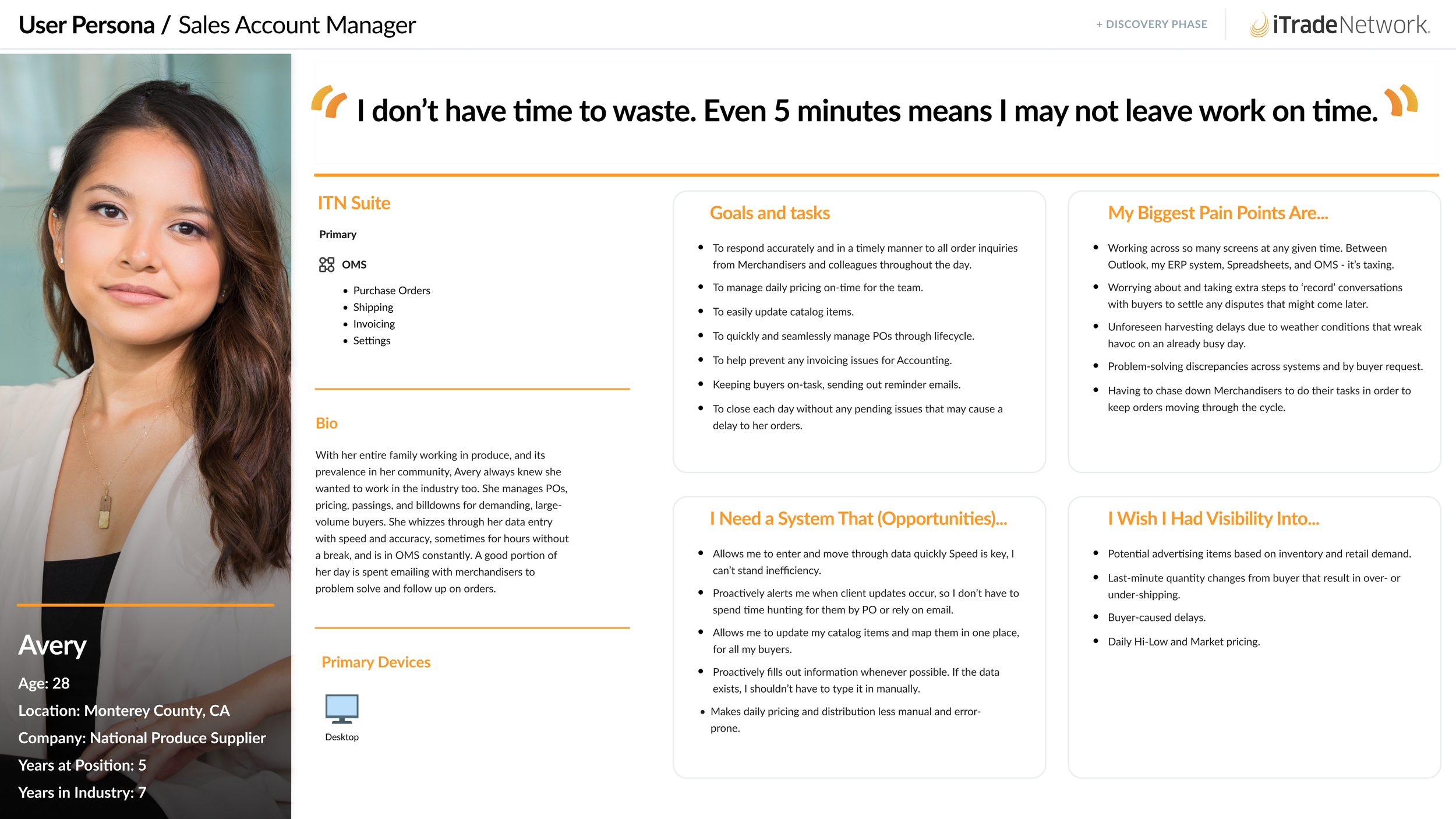
Journey Maps
Outcomes from Usability Testing Benchmarking
We ran side-by-side usability tests on the legacy and new OMS, capturing task success, timing, and user sentiment—giving us clear, data-backed insight into what worked and where improvements were still needed.
Usability benchmarking across iTrade’s modernized systems revealed significant improvements:
Task completion increased by up to 93%
Time on task dropped by up to 83%, signaling more efficient workflows
SUS scores more than doubled for OMSR and Freight
Order Maestro scored a strong 74
User agreement on ease of use jumped from 0% to 71% in some flows
In contrast, legacy tools like iTraceFresh scored poorly and were often described as overly complex—validating the need for further redesign. These benchmarks established a strong baseline and helped prioritize next steps.
Participants
This was one of the most challenging aspects of my role. Before I joined, the design team had no consistent outreach to users to maintain an ongoing dialogue. I was tasked with building a repository of voluntary contacts for interviews—but Sales withheld names due to contract negotiations, and Project Managers guarded access for their sessions. Reaching actual end users was a constant hurdle, so I adapted by sitting in on PM-led calls and capturing relevant insights firsthand.
When it came to ‘on-sites’, those connections came from on high and were usually involved whoever was working that day. We went out to one of the farms and to a distribution center. This was where we saw them struggling to use the tablet in bright sunlight.
For the usability tests & benchmarking, we internally circulated links to the C Suite, Sales, and product teams, along with a SUS score questionnaire, upon completion of the tasks (or not). And, since internal teams couldn’t fully meet our testing needs, we used the platform filters to recruit qualified external participants with relevant experience, including:
Food and beverage professionals
Fashion industry staff (ordering and inventory management)
Accounts receivable specialists
Grocery industry workers
1. Lack of Clarity and Feedback
Users were unsure whether actions were saved or submitted
Error states were easy to miss
New labels didn’t match user mental models
2. Adoption Barriers for Legacy Users
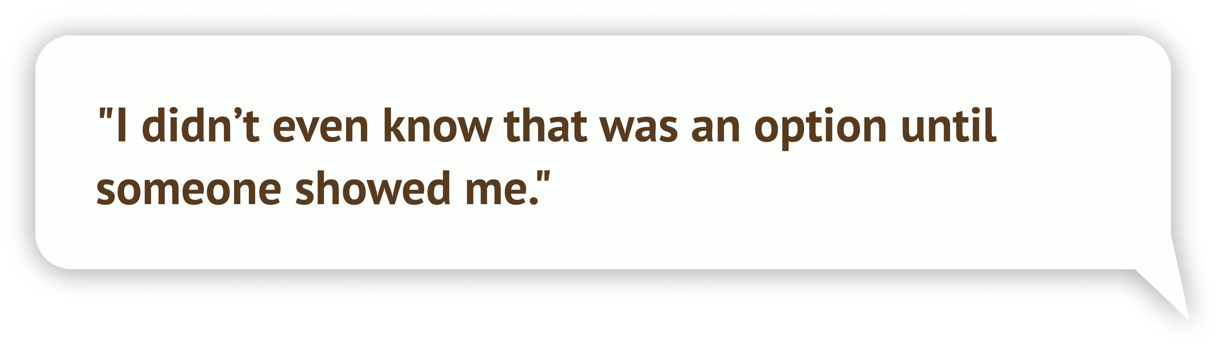
New workflows felt unfamiliar
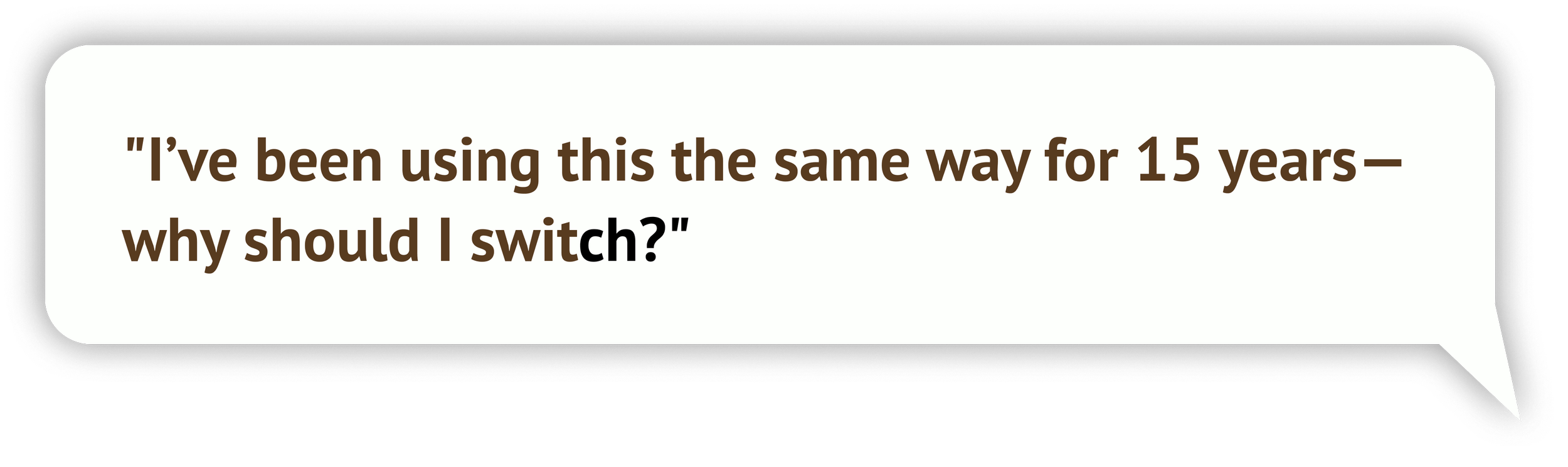
Strong muscle memory made switching difficult
No onboarding or in-product guidance
3. Inefficient High-Frequency Workflows
Slow, inconsistent search results
Too many clicks to complete basic tasks
Confusion on the best way to complete tasks
Quick Links
Final Outcomes: The Measurable Impact
This section includes:
Usability & Performance Metrics
Operational & Business Outcomes
Internal Organizational Outcomes
Our iterative research and redesigned user experiences delivered clear, quantifiable improvements across the platform.
Usability & Performance Metrics
Task completion increased by up to 93%
Time on task decreased by up to 83%
SUS scores more than doubled for OMSR and Freight
Order Maestro scored a strong 74 in usability
User agreement on ease of use jumped from 0% → 71%
New OMS adoption increased by 15% in one quarter
57% faster task time in benchmark comparisons
Operational & Business Outcomes
Reduced customer frustration and support tickets
Improved data integrity across product lines
Strengthened competitive positioning in the supply chain SaaS
Provided leadership with a clear, evidence-based blueprint for future roadmap decisions
Internal Organizational Outcomes
UX processes became standardized
Usability testing was adopted across the design team
Design gained greater influence in prioritization discussions
Implemented reusable patterns for scalable development
Quick Links
Reflection: What I Learned as a Designer
This section includes:
Key takeaways
Closing thought
This project was one of the most formative experiences of my UX career, especially as it combined fast-paced product development with deep research in real-world environments.
Key takeaways:
Relevance beats assumptions.
No amount of internal debate can replace seeing real users in real environments doing real tasks.Legacy systems require empathy.
Long-time customers weren’t resisting change because they disliked the new system — they were experts in the old one.Design must match operational reality.
Tablet glare was never mentioned internally, but in the field, it was one of the biggest usability barriers.Testing early saves months later.
Benchmarking legacy vs modern systems provided the clarity leadership needed to prioritize the roadmap.Cross-functional trust makes or breaks adoption.
Building relationships with Sales, PMs, and Engineering enabled us to gather the right participants and implement the right changes.
Closing thought:
This project reinforced my belief that thoughtful research and evidence-based design have the power to transform not only products, but organizations.